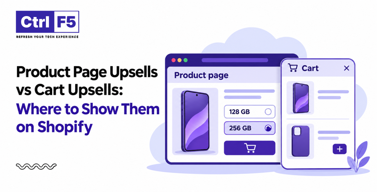


Most Shopify store owners I speak with already accept that upsells can lift order value. Where they get stuck is placement. Should the offer sit right under the Add to Cart button, or wait until the shopper opens the cart? A Shopify product page upsell and a cart upsell can push the exact same product, yet the results rarely look alike, because the shopper is thinking about different things at each point.
My team at ControlF5 sets up and tests both placements on client Shopify stores, and one pattern keeps showing up: when an offer appears matters as much as what the offer is.
Getting Shopify cart upsell placement and product page placement right starts with being clear on what each type of offer asks the shopper to do.
When a Shopify merchant tells me their upsells “don’t work,” the first thing I check is whether they are showing the right type of offer for the page it sits on. People often treat upsells and cross-sells as one thing, but each asks the shopper for a different decision, and that difference decides where the offer belongs.
An upsell asks the shopper to pick a bigger or better version of the product in front of them, such as a 500 ml bottle instead of 250 ml or a premium leather strap instead of the standard one. A Shopify cross-sell suggests a separate product that goes with the first, like a case with a phone or a cleaning spray with suede shoes. The way my team explains it to clients is short: upsell = a better version of the same thing, while cross sell = something that goes with it.
Bundles group two or more products at one combined price, often with a small discount, so they sit between an upsell and a cross-sell. Add-ons are small, low-priced items like gift wrap or spare batteries that need no explanation. Both work best when the extra item clearly helps the shopper use the main product, because an offer with an unclear connection feels like filler that shoppers learn to scroll past.
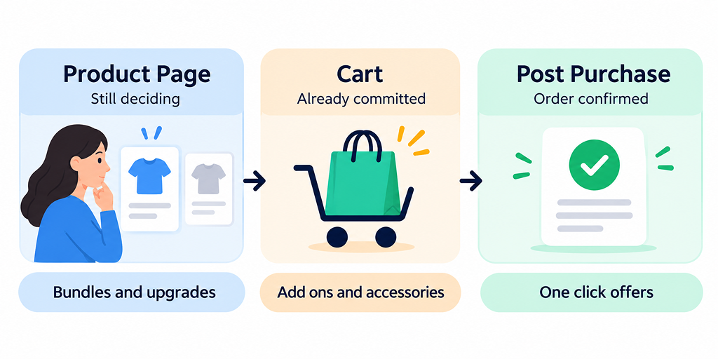
On Shopify, an offer can appear on the product page, in the cart drawer or cart page, or on the post-purchase page after payment. When my team watches session recordings on client Shopify stores, the change in behaviour between the first two is easy to spot. On the product page, shoppers scroll, zoom into images, and read reviews. In the cart, they glance at the total and head for checkout.
Here the shopper has not said yes yet. They are comparing options, checking the price, and looking for reasons to trust the product, so any offer shown here becomes part of that decision. A well-chosen bundle can make the choice easier by showing a complete solution, while a poorly chosen offer adds one more price to think about and one more reason to pause.
Once the item is in the cart, the main decision is done, and the shopper’s focus moves to the total, the shipping cost, whether they see the right payment methods by country, and how quickly they can finish. Adding a $10 accessory to an order that is already happening is a much smaller step than deciding to buy something new.
In short, big offer + undecided shopper → hesitation, while small offer + committed shopper → an easy add. The wrong offer at either stage can distract the shopper enough to leave without buying.
I usually recommend product page offers only when the extra item helps the shopper make the main decision instead of distracting from it, so the offer reads as useful product information rather than a separate sales pitch.
High consideration products like furniture or electronics suit product page offers because shoppers already spend time comparing. Products with size or pack options also work well, since an upgrade such as “pack of 3, lower price per unit” is just one more choice inside the same decision. “Frequently bought together” bundles fit naturally under the product details, upgrades can sit inside the variant selector, and protection plans suit expensive items where shoppers are already thinking about what happens if something breaks.
The biggest risk is pulling attention away from the Add to Cart button. If the offer block looks larger or brighter than the main product details, some shoppers start comparing and leave without adding anything. The second risk is speed, because every upsell widget loads its own scripts and images, and extra scripts are one of the common reasons a Shopify store is slow on mobile. My team removes widgets that slow pages down without earning enough to justify them.
The cart is where most of our clients see their easiest upsell wins, because the shopper has already committed to buying. It also sits one step before payment, so any friction added here can cost you the whole order.
A cart drawer slides open right after the shopper taps Add to Cart, so nearly everyone who adds a product sees the offer at the exact moment they have committed. A full cart page gets fewer visits, since many shoppers go straight to checkout from the drawer or an express checkout button. For most Shopify stores we work on, the drawer is the better first place to test.
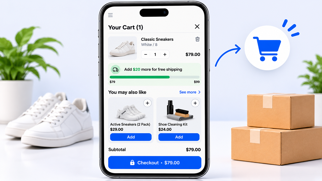
Low-priced add-ons do well because they need almost no thought, like socks or a cleaning kit next to a pair of sneakers. A free shipping progress bar saying “Add $20 more for free shipping” with two matching products below it makes shoppers feel they are saving rather than spending. A Shopify cross-sell based on what is already in the cart also performs well when the match is obvious. Keep it to one to three offers with the checkout button always visible, and if shoppers already add to cart but not checkout, fix that before adding anything new.
This is the comparison my team at ControlF5 uses when planning offers for a client, before any testing begins.
| Factor | Product Page Upsell | Cart Upsell |
| Shopper mindset | Still deciding | Already committed |
| Best offer type | Upgrades, bundles, protection plans | Add ons, accessories, free shipping fillers |
| Offer price | Can be close to the main product price | A small share of the cart total |
| Main risk | Distracting from Add to Cart | Slowing down checkout |
| Metric to watch | Product page conversion rate | Offer take rate and AOV |
If your Shopify store has never run upsells, start with the cart. It carries less risk because the first item is already added, and nearly every shopper who adds a product sees the offer, so data comes in quickly. Once cart offers are working, test a Shopify product page upsell on your best selling products, where bundles and upgrades have the most room to help and enough traffic to read results quickly.
Shopify merchants often forget the third placement entirely. A Shopify post purchase upsell appears after payment, so it cannot cause cart abandonment; the worst outcome is that the shopper ignores it. That safety makes it a good place for bolder offers, such as a discounted second unit, that would feel pushy earlier.
A thank you page offer usually asks the shopper to start a fresh order, and many will not bother going through checkout again. A one click offer appears between payment and the thank you page and adds the item to the existing order without entering card details again, which is why it usually gets far more acceptance.
The rule my team follows is one offer per stage and never the same product twice: bundle + add-on + accessory = three different asks at three different moments. If a shopper skipped a phone case on the product page, showing that same case again in the cart and once more after payment tells them the Shopify store is not paying attention. Spreading different, well-matched offers across the journey feels more like helpful service, and shoppers respond to that far better than to repetition. It also gives you three separate places to test, so you can learn which stage your audience responds to most.
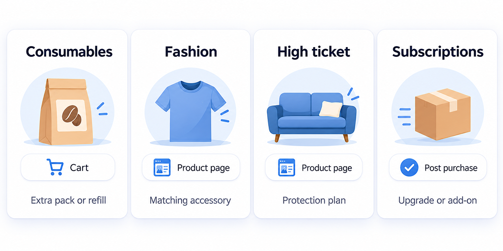
What you sell changes where offers belong, because a ₹500 supplement and a ₹50,000 sofa are bought in very different ways. Here is the starting point my team uses before testing.
| Product category | Best first placement | Offer that usually fits |
| Consumables and repeat purchase products | Cart | Extra pack, refill or a trial size of a related product |
| Fashion and apparel | Product page | Complete the look items and matching accessories |
| High ticket products | Product page | Protection plan, setup service or premium version |
| Subscription products | Post purchase | An add-on for the next delivery |
For fashion brands, keep cart offers to items that need no size choice, such as socks, belts or bags, because a size picker inside the cart slows shoppers down and rushed size choices often turn into returns. Complete the look offers belong on the product page instead, where shoppers are already thinking about style and fit.
High ticket products work the other way around. Shoppers research heavily before buying a sofa or a laptop, so protection plans, setup services, and premium versions on the product page answer questions they already have. Consumables are bought often and with less thought, so a quick cart offer for an extra pack or a related trial size fits the way people actually shop for them. Subscription brands can keep the checkout clean and save their offer for after payment, when adding an item to the next delivery feels like a small, easy choice.
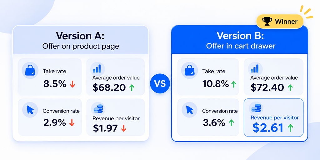
Any upsell strategy Shopify merchants rely on should rest on numbers, not guesses. My team never calls a placement a winner until the data backs it, because clicks alone can hide a drop in completed orders.
| Metric | What it tells you | Watch out for |
| Offer take rate | Share of shoppers who accept the offer | A high take rate on a very cheap item may add little revenue |
| Average order value | Whether orders are getting bigger | AOV can rise while total orders fall |
| Conversion rate | Whether the offer is scaring buyers away | A drop here can cancel out AOV gains |
| Revenue per visitor | The combined effect of AOV and conversion | The most reliable single number for judging a test |
The rule we share with clients is that higher AOV + steady conversion rate = a real win, while higher AOV + falling conversion rate = a warning sign. If order value is low even before upsells come in, the common reasons your Shopify average order value stays low are worth fixing first.
Change one thing at a time, whether that is the placement, the offered product, or the price, so the result points to a single cause. Split traffic evenly and avoid big sale periods, since Shopify Black Friday strategies need their own planning and shoppers behave differently during sales. Run each test for at least two full weeks, and longer for smaller Shopify stores, because a decision made on a handful of orders can lock in a weaker setup for months.
Most upsell problems our Shopify experts find during audits are not technical. The offer is simply in the wrong place, at the wrong price, or unrelated to the product.
Many Shopify upsell apps default to showing best sellers or random products when no rules are set, and a phone charger suggested under a dress makes the Shopify store look careless. Price causes a similar problem: an offer that nearly doubles the order total feels like a second buying decision, especially in the cart. Set clear rules so every offer links to the main item, keep cart offers clearly cheaper, and move higher-priced offers to the product page or after payment.
Upsell blocks that look neat on desktop can push the Add to Cart or checkout button below the fold on a phone, so always check offers on a real mobile screen before they go live. Popup + drawer offer + shipping bar fired within seconds of each other = three asks in ten seconds, which is too many. Pick one main offer for each moment and let it do its job.
Before installing anything, check what Shopify already gives you, which is the first step in every Shopify app integration project my team handles. The free Search & Discovery tool from Shopify lets you set complementary products that many themes display on the product page, with very little effect on speed.
A dedicated Shopify app makes sense when you need cart drawer offers, display rules, or bundle pricing. My team built UpCartAOV for this exact need, with cart drawer and product page recommendations Upsell and cross sell that can be set up without custom code. Look for targeting rules, such as showing an offer only when a certain product is in the cart, built-in analytics that report take rate and revenue, and compatibility with your theme on both desktop and mobile. A short trial on a duplicate theme is the safest way to check all of this before going live.
Run a speed test on your product page and cart before and after installing, and note the load time and performance scores each time. If load time rises noticeably, check whether the scripts load on every page or only where offers actually appear, because limiting them to the right pages can recover most of the lost speed. If the slowdown remains, weigh it against the extra revenue the offers bring in before deciding to keep the tool.
These are the Shopify AOV tactics my team keeps coming back to, because they follow how shoppers behave at each stage. Across projects, the changes are usually simple: we move offers out of crowded product page sections, add a cart drawer with one or two well-matched add-ons, tie cart offers to a free shipping threshold, and remove overlapping widgets that slow pages down. Put simply, right offer + right stage + fast page = higher order value, and if one of the three is missing, the other two struggle to carry the result.
Two of our projects show how offer placement works alongside the rest of the buying journey. In both, the gains came from a mix of design, speed, and flow changes, so placement was one part of the result rather than the only cause.
Promunch came to us with a cluttered layout that made products hard to compare. As the Promunch Shopify redesign explains, my team built a custom theme, cleaned up product pages so reviews, benefits, and ingredients were easy to scan, and added product recommendation blocks, combo offer pages, and bulk order sections to encourage multi-item carts. Pages also got lighter through image compression and fewer scripts. The reported results were an 18% lift in average order value, a 28% lift in conversion rate, and pages loading up to 30% faster.
The Alpine Apothecary was moving from WooCommerce, and its old WooCommerce site had no upselling, cross-selling, or bundling in place. In the Alpine Apothecary migration, my team focused first on the basics: quick add to cart on mobile, a simpler checkout flow, clearer product pages, and a 55% faster load time. Engagement rose by 40% and mobile sales by 20%, which is exactly the kind of healthy cart and checkout base that cart offers need before they can perform.
Placement decides how an offer feels to the shopper. On the product page, the shopper is still deciding, so bundles, upgrades, and protection plans that help them choose fit best there. In the cart, the main decision is made, so the offer has to be small, related, and easy to add in one tap. After payment, the first sale is safe, which leaves room for bolder offers.
Start with Shopify cart upsell placement since it carries the least risk, then test product page offers on your best sellers. Change one thing at a time, keep pages fast, and judge every change by revenue per visitor rather than clicks. If you want a second opinion, my team can review your product page and cart flow and tell you what to move, cut, or test first.
Question: Should upsells go on the product page or in the cart on Shopify?
Answer: Both can work, but they suit different offers. Cart offers carry less risk because the main item is already added, so they suit small add-ons and accessories. Product page offers suit upgrades and bundles on high consideration products where shoppers spend time comparing. Most Shopify stores do best starting with the cart, then adding product page offers on best sellers.
Question: Is a Shopify post-purchase upsell better than a cart upsell?
Answer: Neither is better on its own, because each reaches the shopper at a different moment. An offer after payment cannot hurt the first sale, so it suits bolder offers like a discounted second unit. A cart offer reaches more shoppers because it appears before anyone pays. Many Shopify stores use both, with a different product at each stage.
Question: Can I add upsells without installing a Shopify app?
Answer: Yes, for simple product page offers. Shopify’s free Search & Discovery tool lets you set complementary products, and many themes show these on the product page with little effect on speed. For cart drawer offers, display rules, or one-click offers after payment, you will usually need a Shopify upsell app.
Question: How many upsell offers should one Shopify store show?
Answer: A simple upsell strategy Shopify merchants can follow is one offer on the product page, one to three in the cart and one after payment. More than that starts to feel pushy, and on mobile, extra offers can push the Add to Cart or checkout button out of view. Fewer, well-matched offers almost always perform better.


Think of a store in a busy market. Shoppers pick up products, load their baskets, and then put everything down by the door and walk away without paying. Any shop owner would want to know why.
Learn what average order value means, why it may be low, and 9 proven ways to increase it using Shopify’s built-in tools.
Is your Shopify store struggling to rank on Google? Discover common SEO problems affecting visibility and learn how to identify and fix indexing, technical, and content issues.