



A Shopify store can look polished on a laptop and fall apart the moment someone opens it on a phone. Buttons slide under images, text runs off the edge of the screen, and a banner that looked sharp on desktop turns into a thin, blurry strip.
The tricky part is that merchants rarely catch these problems on their own. You edit the Shopify store on a laptop, check it on your own phone, and both look fine. A shopper on an older Android phone, an iPad, or an iPhone with larger text turned on can still see something quite different.
Every screen size, browser and device setting shows a slightly different version of your Shopify store, and a small change made for one of them can quietly affect the others.
At ControlF5, I have worked with Shopify stores for years, and Shopify responsive design issues remain one of the most common reasons merchants come to my team.
Almost every one of them has a clear cause and a clear fix.
A Shopify store is not supposed to look identical on every screen. A good Shopify theme is built to adapt. On desktop you might see a full menu across the top, and on a phone that same menu folds into a small icon with three lines.
Product grids that show four products in a row on a laptop usually drop to two on a phone. These changes are intentional, and they are what responsive design means: one website that rearranges itself to fit the screen it is viewed on.
The trouble starts when the differences are not intentional. Here is what that usually looks like:
Layout shifts and broken sections: A section designed with three columns on desktop sometimes stays at three columns on a phone that is only 375 pixels wide. Each column gets squeezed so narrow that the text wraps after every two words. nother common sight is content jumping around while the page loads. You start reading a product title, an image finishes loading above it, and the title suddenly drops lower on the screen. Google even measures this movement as part of its page experience signals, so it affects more than just looks.
Font, color and image differences: Sometimes the font you chose shows up on your laptop but a plain default font appears on a customer’s phone. Colors can look washed out on one screen and too strong on another. Images are an even bigger culprit. A hero banner with the product placed on the right side may get cropped on mobile, and the product itself disappears from the frame, leaving only background.
Elements that disappear or overlap on mobile: This is where most Shopify mobile display problems become costly. A sticky Add to Cart bar covers the live chat button. A discount popup is taller than the phone screen, so its close button sits below the visible area and the shopper cannot dismiss it. A size chart link that is visible on desktop gets hidden on mobile because a Shopify theme setting was switched off. When customers cannot tap, close or find something, they leave.
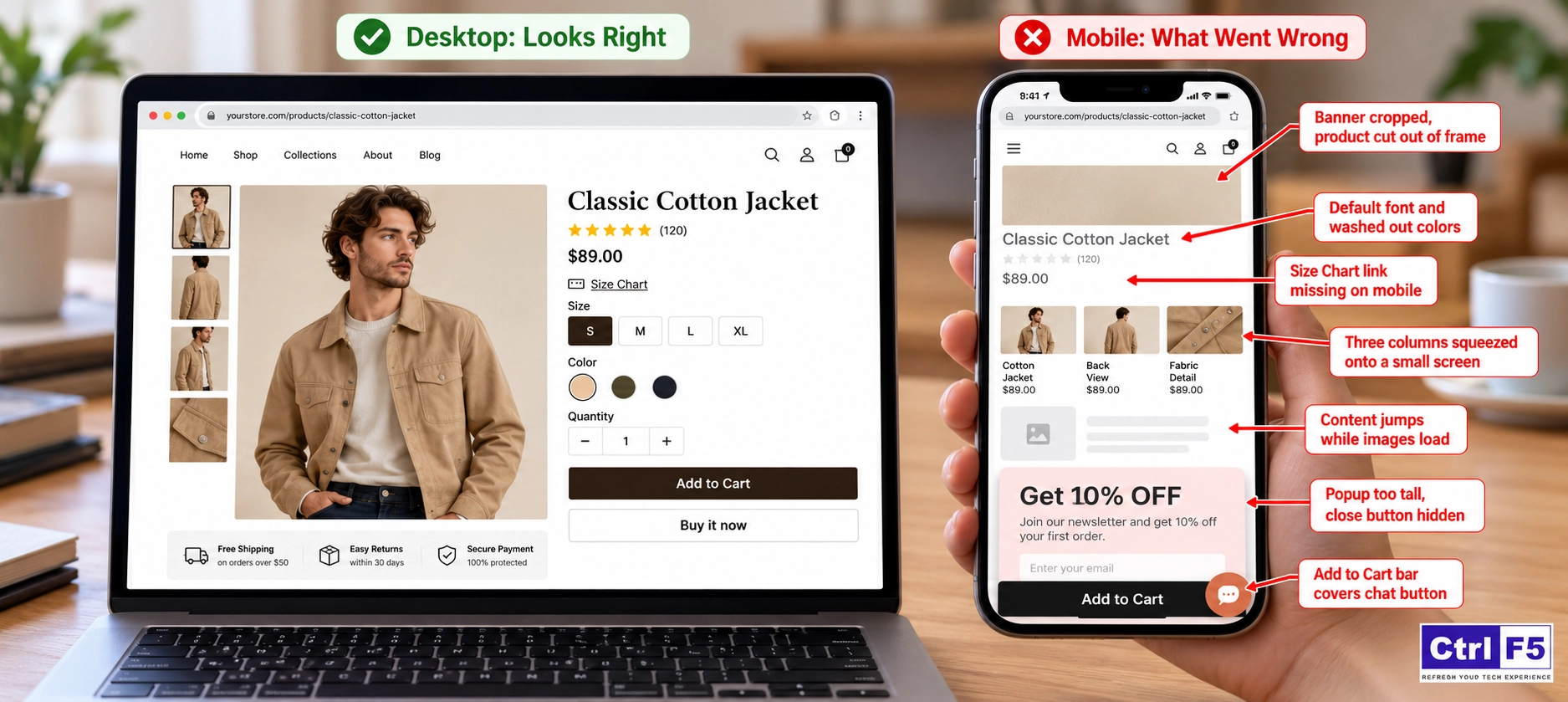
When my team audits a Shopify store, the Shopify responsive design issues we find usually trace back to one or more of the following causes:
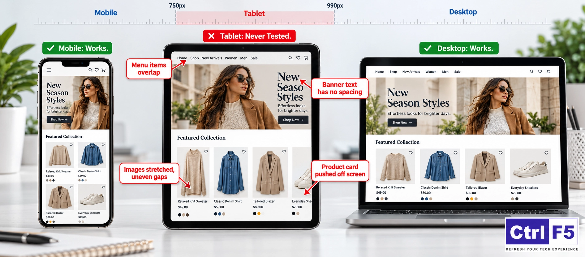
A breakpoint is the screen width at which a Shopify theme switches from one layout to another. Shopify’s free Dawn theme, for example, changes its layout at around 750 pixels and again at around 990 pixels.
Anything below the first point gets the mobile layout, anything above the second gets the desktop layout, and the space in between is treated as a tablet.
That middle zone is where many problems hide. An iPad held upright is roughly 768 to 820 pixels wide, so it lands in the tablet layout, which most Shopify merchants never check.
A well-built Shopify responsive theme handles all three zones carefully. Older or poorly coded Shopify themes often only handle desktop and phone properly, and everything in between looks awkward.
If your current Shopify theme struggles on tablets and phones, take a look at these free Shopify themes that work well across devices before you spend money on a premium one.
CSS is the code that controls how things look: sizes, colors, spacing and positions. When a developer adds custom CSS to a Shopify store and sets a fixed width, such as a section that is always 1200 pixels wide, that section cannot shrink on a phone and either overflows the screen or creates a sideways scroll. Fixed heights cause similar trouble.
A text box set to exactly 300 pixels tall may fit its text on desktop, but on a phone the text wraps onto more lines and gets cut off at the bottom. Large spacing does damage too, since a 100 pixel left padding that looks small on a monitor takes up more than a quarter of a phone screen.
In many of the Shopify stores my team audits, several developers have added custom CSS over the years. Each wrote rules in a different file and tested them only on desktop. Some of those rules use a command called !important, which forces a style to override the Shopify theme’s own rules. That works on the screen it was written for, but it stops the Shopify theme from applying its mobile styles to that element, and when two forced rules clash, the problem becomes very hard to trace.
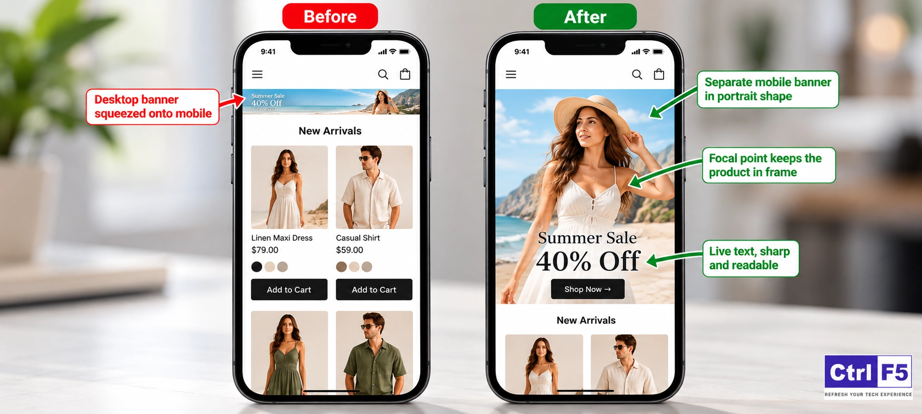
A wide banner sized at 1920 by 600 pixels looks great on a monitor. On a phone, the same image shrinks to roughly 375 by 117 pixels, and any text placed inside it, like “Summer Sale 40% Off,” becomes too small to read. Product photos cause a different kind of mess.
When I review a collection page on mobile, I check whether all product images have the same shape. If some are square, some tall and some wide, the cards in a two column mobile grid end up at different heights, and prices and Add to Cart buttons stop lining up. On desktop, with more space around each card, the difference is far less noticeable.
Image quality creates its own Shopify mobile display problems. Phone screens fit far more pixels into a small area than most laptop screens, so an image that looks fine at 800 pixels wide on a laptop can look soft or blurry on a modern iPhone.
Uploading a 6 MB PNG photo to be safe goes wrong the other way, since it slows the page down on mobile data and shoppers may see an empty block for a few seconds before the banner appears. Both mistakes come from choosing image files based on the screen they were made on, not the phones most shoppers actually use.

Every Shopify app that shows something on your Shopify store, such as reviews, popups, wishlists, chat widgets or upsell blocks, brings its own code and styling. Two Shopify apps can fight over the same spot on the screen, or a Shopify app’s styling can override your Shopify theme’s fonts and spacing.
Another issue we find often is leftover code. When a Shopify app is uninstalled, some older Shopify apps leave snippets behind in Shopify theme files, and those snippets keep affecting the layout long after the Shopify app is gone.
Browsers read the same code slightly differently. Safari is the one that causes the most surprises, and since nearly every browser on an iPhone runs on Apple’s WebKit engine, a Safari quirk affects most iPhone shoppers. Two examples my team fixes regularly:
Firefox also renders fonts and spacing a little differently from Chrome. These small gaps add up and become real Shopify mobile display problems.
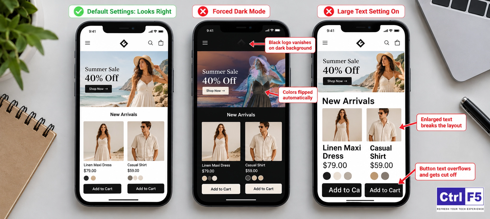
Some phones and browsers, Samsung Internet being a well-known one, can force dark mode on websites. This flips light backgrounds to dark ones automatically. If your logo is a transparent image with black text, it can become nearly invisible on a forced dark background.
Text scaling causes similar trouble. Many people increase the default font size on their phones for easier reading, and a button designed for small text can overflow or cut words in half when that setting is on.
Designing for larger text and different display settings is a big part of building an inclusive Shopify store, and if you want to understand the bigger picture, read why accessibility is important in web design.
Sometimes the Shopify store is fine and the device is simply showing an old saved copy. Browsers store files to load pages faster, so after a change you might still be looking at the previous version.
On the other side, an outdated Shopify theme can genuinely cause problems. Shopify theme developers release updates to support new devices and browser versions, and a Shopify theme that has not been updated in years misses all of those fixes.
Not Sure What Is Breaking Your Shopify Store on Mobile?
Shopify theme breakpoints, custom code, unoptimized images, conflicting Shopify apps and browser quirks can all make your Shopify store look different on each device. We can review your Shopify store across phones, tablets and browsers and tell you exactly what is causing the issue.
You cannot fix what you have not seen. These are the methods my team uses, from the quickest to the most thorough:
Once you know what is broken and where, you can fix Shopify layout issues in a structured way. Start with settings, then move to code only if needed.
Many modern Shopify themes, especially Online Store 2.0 themes, already include mobile specific options that Shopify merchants miss. Inside the Shopify theme editor, click a section and look for settings like number of columns on mobile, enable swipe on mobile or a separate mobile image.
For example, a collection section showing four products per row can be set to two on mobile with swipe enabled. That fixes squeezed product cards without touching any code.
Before changing anything, I switch the editor preview to mobile so I can see each change as I make it. Settings that don’t mention mobile or desktop usually apply to every screen size. A font size or spacing change made to fix the phone view can break the desktop view. Mobile settings don’t all stop at the same width either, and in some Shopify themes they also change the tablet view.
The editor has no tablet preview, so once the phone view looks right, check a tablet width in your browser’s developer tools too.
A media query is a CSS rule that says “apply this style only when the screen is narrower or wider than a certain size.” This is how a developer tells a section to behave differently on phones.
When we clean up a Shopify store, we replace fixed pixel widths with flexible widths that scale with the screen, remove forced overrides that are no longer needed, and gather scattered custom code into one place, such as the Shopify theme’s Custom CSS setting. This makes future fixes much easier because nobody has to hunt through ten files to find a single rule.
Code fixes feel risky? Let us handle them.
Shopify theme settings are easy to change on your own, but editing CSS and Shopify theme code can break other pages if it is done without testing. We fix layout problems at the source and tests every change on real devices before it goes live.
Upload images large enough to stay sharp, but not oversized. Shopify automatically serves smaller versions of your images to smaller screens when the Shopify theme is coded properly, so you rarely need to upload separate files for that. What you should do is:
Duplicate your live Shopify theme first and work on the copy. Then turn off Shopify app widgets one at a time and preview the page on mobile after each change. When the problem disappears, you have found the conflicting Shopify app. After that, check your Shopify theme files for leftover code from Shopify apps you uninstalled long ago.
Wherever possible, choose Shopify apps that use Shopify’s app embed system, because those can be switched off cleanly from the Shopify theme editor without leaving code behind.
If your font looks different on certain devices, the font file is probably not loading there. Fonts picked from Shopify’s own font library inside the theme settings load reliably across devices.
If you use a custom brand font, upload it in a modern web format and set a fallback font that looks similar, so the page does not jump to a completely different style if the custom file fails. Also keep body text and form fields at 16 pixels or more on mobile, which solves the Safari auto zoom issue I mentioned earlier.
If your Shopify theme is several versions behind, updating it can fix Shopify layout issues you have been patching by hand. Your Shopify theme library shows when an update is available. Always update a copy first, since customizations made directly in Shopify theme code may not carry over automatically.
A current Shopify responsive theme gets ongoing fixes for new phones and browser updates, which saves you from chasing every new device yourself.
After every fix, check the result in a private or incognito window, or do a hard refresh, so you are not looking at an old saved copy. On a laptop, press Ctrl + Shift + R on Windows or Cmd + Shift + R on a Mac. Phones have no hard refresh, so the easiest way to check there is to open the Shopify store in a private tab. Give it a few minutes as well, because Shopify’s delivery network can take a short while to serve the newest files everywhere.
Make sure you are also checking the right theme. Many Shopify merchants make fixes on a duplicate theme and then check the live Shopify store, where nothing has changed yet. Others keep a preview link open and think the changes are live when the theme was never published.
Fixing problems is useful. Not creating them in the first place is better. Across the Shopify stores my team works on, most traffic comes from phones, so a strong Shopify mobile UI is no longer optional.
If you want to go beyond design fixes, my guide on how to optimize your ecommerce site for mobile users covers speed, navigation and checkout improvements that help phone shoppers buy with less effort.
Many display problems can be fixed through Shopify theme settings alone. Some cannot. It is time to bring in a specialist when:
That last point is often the real wake up call. If your desktop visitors buy far more often than your mobile visitors, design is usually part of the reason.
At ControlF5, my team works on Shopify every day, and device-specific bugs are some of the most common problems we track down and fix. We test your Shopify store the way your customers actually use it, find what is breaking on each screen, and fix it at the source instead of patching it one page at a time.
If your Shopify store is not behaving the same way on every device, book a free consulation with us, and we will find out why.
Your customers never see your Shopify store the way you see it in the Shopify theme editor. They see it on a cracked Android screen, on an iPhone in bright sunlight, or on a tablet balanced on a sofa arm. Each of those views decides whether they buy.
The causes behind most display problems are known and fixable, from breakpoints and image shapes to Shopify app conflicts and browser quirks.
Check your Shopify store the way your shoppers use it, fix Shopify layout issues as soon as you find them, and treat every device as the one that matters most.
Question: Why does my Shopify store look fine on desktop but broken on mobile?
Answer: Most of the time it comes down to fixed widths in custom code, images designed only for wide screens, or Shopify theme settings that were never adjusted for mobile. These Shopify mobile display problems usually show up after customizations or Shopify app installs rather than in the original Shopify theme.
Question: Can Shopify apps change how my Shopify store looks?
Answer: Yes. Shopify apps add their own code and styling to your Shopify store, and that can override your fonts, spacing or layout. Uninstalled Shopify apps can also leave code behind, so the effect can continue after the Shopify app is gone.
Question: How do I make my Shopify store look the same on iPhone and Android?
Answer: Use fonts from Shopify’s font library or properly uploaded custom fonts with fallbacks, keep form text at 16 pixels or larger, set colors globally in theme settings, and test on both platforms. These steps go a long way toward Shopify design consistency across devices.
Question: Does every Shopify theme work well on all devices?
Answer: No. Themes from the Shopify Theme Store must meet mobile standards, but quality still varies, and older or third-party themes may handle tablets poorly. A well maintained Shopify responsive theme that receives regular updates is the safest foundation.
Question: How often should I test my Shopify store on different devices?
Answer: Test after every Shopify theme edit, Shopify app install or Shopify theme update, and do a full check of your key pages once a month. Regular testing catches Shopify responsive design issues before they cost you sales.



Most Shopify store owners I speak with already accept that upsells can lift order value. Where they get stuck is placement.

Think of a store in a busy market. Shoppers pick up products, load their baskets, and then put everything down by the door and walk away without paying. Any shop owner would want to know why.

Learn what average order value means, why it may be low, and 9 proven ways to increase it using Shopify’s built-in tools.